Charts Grade: D
Overview:
eOption's charts are not competitive with the charts offered at most other brokers. The basic charts, though somewhat on the small side and very limited in functionality, are at least attractive. The advanced java charts are extremely small and surprisingly lacking in features. For example, there is only a small selection of technical indicators whose settings are not customizable. Other standard features, such as drawing tools and savable chart settings, are not present. eOption customers are better off using almost any of the free charting websites on the internet.
Details:
eOption features two different types of charts: interactive & comparative charts and java charts. The former charts are useful for basic charting features while the latter offer more advanced features. Let's look at the interactive & comparative charts first:
Interactive & Comparative Charts
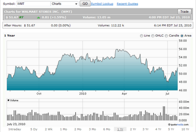
Here is a one year area chart for Walmart (WMT) (click on images for larger views):
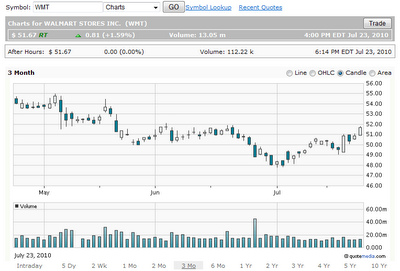
Next is a three month candle stick chart:
The basic charts are fairly attractive but are very limited in functionality. Now let's take a look at the more advanced java charts.
Java Charts
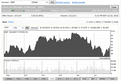
Here is a one year area chart for Walmart (WMT). Notice how these charts are smaller and less attractive than the basic charts:
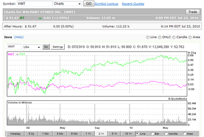
Next is a two year line chart comparing Walmart (WMT) with Target (TGT). Only two stocks and an index can be compared on a single chart:
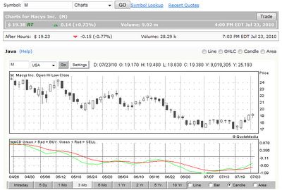
The java charts have a few basic types of technical indicators to choose from, including moving averages, RSI and stochastics. Note that only one technical indicator (which includes volume) can be shown at once and none of the indicators can be customized, making their usefulness pretty limited. Here is a three month candle stick chart of Macy's (M) with the MACD indicator shown at the bottom:


